PROJECT FOR
General Assembly UX
Design Immersive 10-week Course
MY ROLES
UX Research
Usability Tests
UI Design
UX Research
Usability Tests
UI Design
SUMMARY
Identify problems with the current ActiveSG app and create a redesigned solution that will help identified personas reach their goal easily
Identify problems with the current ActiveSG app and create a redesigned solution that will help identified personas reach their goal easily
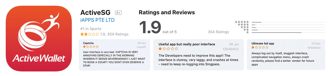
What's the problem?
ActiveSG launched in 2014. It aims to provide a comprehensive sports infrastructure, through facilities and activities, to Singaporeans experiencing and sharing the joy of living better through sport.
As we peek into the AppStore reviews, it’s not a rosy picture. The app despite being no.1 in Sports only has an overall rating of 1.9 out of 5. Through the one star ratings, we could see the general complaint is about “bad user interface.”
Setting the plan
As this would be an intensive project and we had a team of 3, we devised a plan at the start so that we are clear on the steps and goals. Our redesign methodology utilised the UK Design Council’s ‘Double Diamond’ process.

- Heuristic Evaluation
- Usability Tests with Current Users
- User Interview
- Guerilla Interview
- Content Audit
- Affinity Mapping
- Persona Development
- Customer Journey Map
- Design Goals

- Sitemap
- Sketching Lo-Fi Wireframes
- Wireframing
- Usability Test on Wireframes
- Hi-Fi Interactive Prototyping
- Usability Testing on Hi-Fi Prototype
- Final Interactive Prototype
- Presentation
We had overlapping roles in the project, but my primary responsibilities in the project were:
- User Interviews / Guerilla Interviews
- Wireframe
- Content Audit / Sitemap / Information Architecture
- Interactive Prototyping
Discovering the problem
Being curious about what the reviews meant by “bad user interface,” we did our evaluation by being users of the app itself and employing Jakob Nielsen's 10 Usability Heuristics.
However, we needed our validation through usability tests and user interviews.
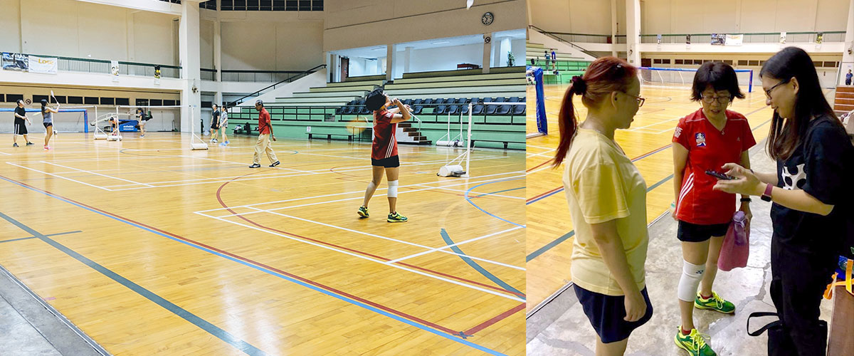
User/Guerilla Interviews
Our initial interviews limited our user base to the age of 25 to 30. To widen our age group, we did a site recce nearby to see if we can find different insights.
Findings
Our results from 10 user interviews and usability tests provided us with the following insights
How do they use the app?
Booking can be competitive as users must wake up at 7 am to reserve the courts for playing 15 days after.
Why they use the app?
A mobile app is a preferred since it’s faster and readily available by their side compared to a website.
Who books the facilities?
Two distinct group of users uses the app. One who only uses the free ActiveSG credits and another who uses credit cards to pay.
USABILITY ISSUE #1
Navigation issues
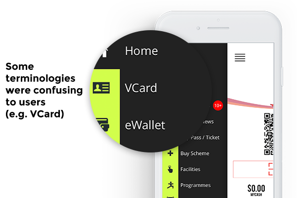
- Users didn’t understand what “VCard” is for and couldn’t identify passes are for swimming and gym entry points.
- Having too many items on the side menu posed a problem when some users didn’t know it’s scrollable and it doesn’t help when they only utilise what they need.
Wow, that's a lot of items in the menu!

USABILITY ISSUE #2
Unnecessary/Unclear information
- Users didn’t understand what the QR code and scan feature.
- While some users appreciated the lion waving at them, the push of essential content down was too much of a trade-off.
- Mood selection at the bottom was redundant and useless.
I feel like waving back to the lion! But why is he pushing all the important information down?

USABILITY ISSUE #3
Booking process pain points
- There was no way to find nearby facilities if they missed their chance to book a court based on their timings.
- Countdown timer being too distracting.
- Not being able to identify the favourites button and how One-Touch Booking can help them.
- Ability to select both eWallet and Credit Card during checkout confused the users.
It's really difficult to find a nearby backup facility if I miss our regular booking slots.
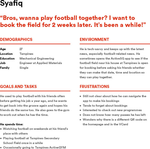
Understanding our users
From the user interviews, we identified two primary personas:
The pro user
He/She books the facilities at least once a week and brings his/her children for swimming lessons.
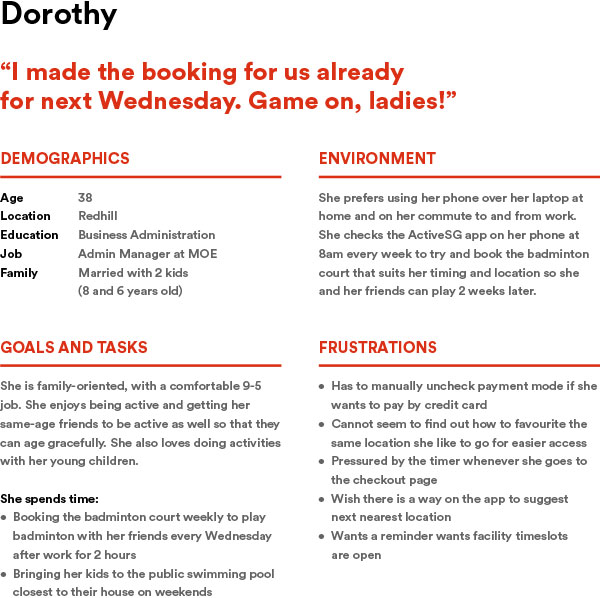
The casual user
Uses the app infrequently, because he/she takes turns with his/her friends to book facilities or rely on friends and family members to book instead.
We then map out Customer Journey Map based on our research phase to identify possible opportunities for improvement.
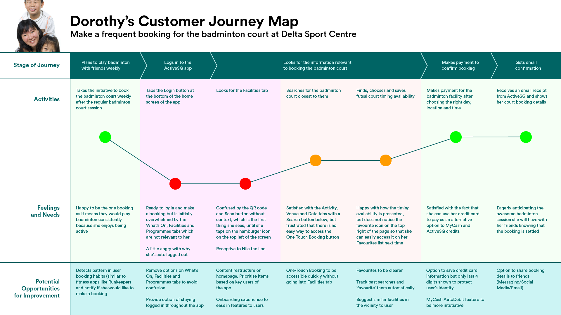
For example, pro users will need an Onboarding feature after they sign in due to the revamp, as they might be in a shock and clueless on how to use the new app,
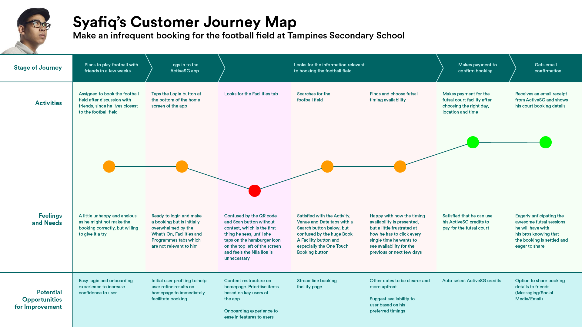
For example, casual users can utilise a sharing function to alert his/her friends about the activity they just booked, or set a calendar reminder to schedule so he/she doesn't forget.
DESIGN GOAL
We then set our core objective for the app redesign:
Streamline and simplify the core user experience for booking facilities and buying a gym and swim passes.
• • • • •
Create a consistent and coherent user interface across all screens of the redesigned ActiveSG app.
Designing the solutions
SOLVING PROBLEM #1
New Information Architecture
We proceeded with content audit, card sorting and tree sorting in an attempt to solve the navigation pain points, as highlighted in the Discovery phase.
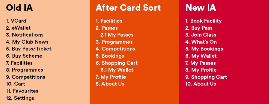
The new information architecture was refined after the card sort results:
- My Passes (2.1) was brought out as a separate section so that our personas (Dorothy and Syafiq) can access them easily when they reach the gym/swimming complex.
- My Wallet (6.1) was also separated from Shopping Cart as users should be able to top up credits even before accessing the cart.
However, they are taken into consideration for cross-linking.
SOLVING PROBLEM #2
Unnecessary information on the homepage
We started out with sketching in a paper so that we can define the important elements in the homepage. Our decision was to keep only helpful stuff on the homepage and reduce all the clutter it previously had.
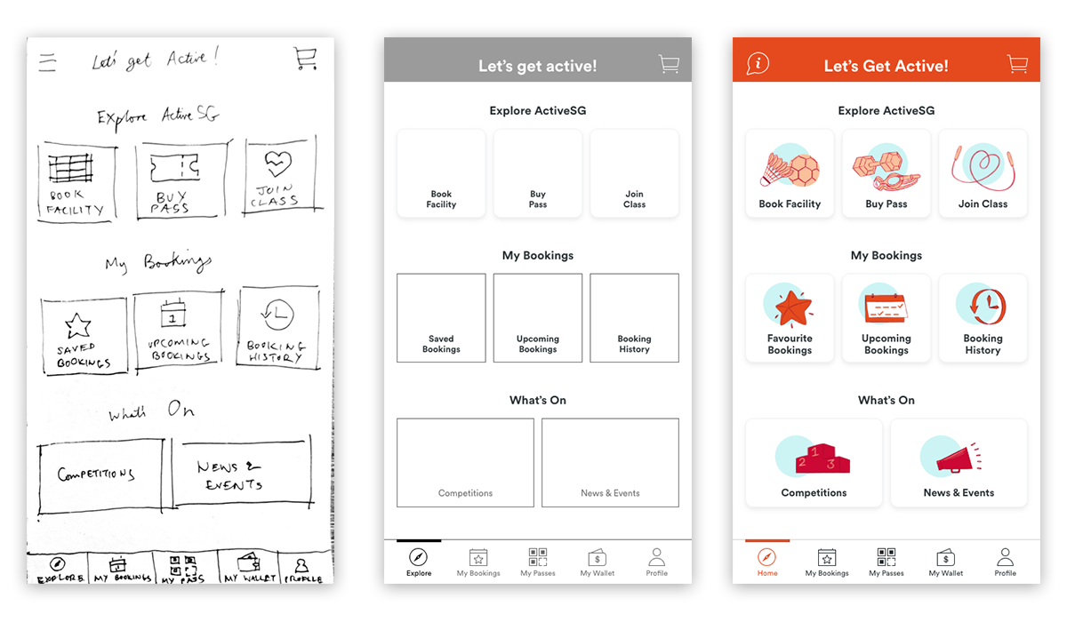
After we reach an agreement, we transferred the lo-fi wireframes to Adobe XD to have our first round of Usability Test.
SOLVING PROBLEM #3
Booking process pain points
Current app does not have a ‘Suggest Nearby’ function to help users find alternatives if they miss their booking slots.

Therefore, our proposed solution is to have a button readily available to access the information quickly.
ITERATION #1
Time slots confusion
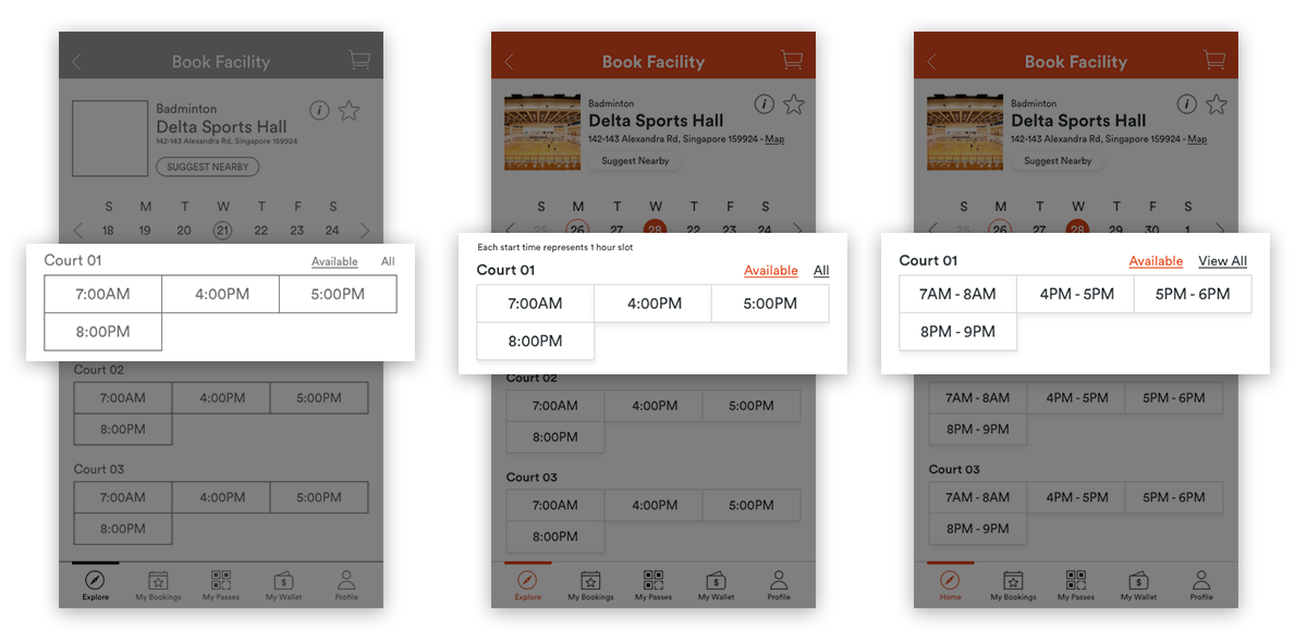
Wireframe stage
The new or infrequent user wasn’t sure how to book a 2-hour time slot.
Hi-Fi prototype stage
We added the note “Each start time represents 1-Hour slot”, but our users still faced the same issue, and we verified it with our users as the font is too small or in a blind spot.
Final prototype
We decided to change the slots to indicate the actual time range so that we don’t sacrifice the space for the instructional message and provide direct clarity instead.
ITERATION #2
Weekend/Weekday passes
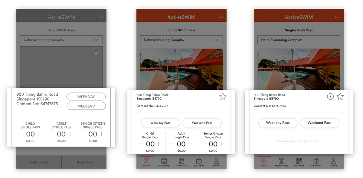
Wireframe stage
Users choose Child/Adult/Senior Citizen pass type first and tend to ignore Weekday/Weekend options.
Hi-Fi prototype stage
We made the buttons larger and centralised since users gave feedback their eyes scan from the left to right. However, users still notice the larger pass types first.
Final prototype
To solve the issue, we split the process so that users have to choose weekday or weekend pass first, before selecting the number of passes they need.
Delivering the result
To have a form of quantitative metrics, we used the System Usability Scale to compare the current and redesigned app and the results were impressive.
Our redesigned app had an astounding score of 90.5 versus the current app at 38.214.

ActiveSG App Redesign
Interactive Prototype
QUOTE OF THE PROJECT
"It's amazing what you can accomplish if you do not care who gets the credit"
- Harry S Truman
Learnings
I attribute the success of the redesign to my teammates as we worked together with great synergy. There was no lack of communication and our goals were aligned.
Next Steps
There’s no finish line to the redesign.
- While we were doing research, we identified a secondary persona who needed a form or matching up with other sports enthusiasts. It was not considered for this round because we had to focus on the core feature of the app instead and deliver a Minimum Viable Product (MVP).
- We will want to explore that route and see how we can integrate that feature into our redesign.
- Micro interaction animations are also something we would like to explore, so the app doesn’t just look only functional.
To the committee of ActiveSG, do hit us up if you would like to discuss adopting our redesign!
Like what you see?
Let's chat.
Like what you see?
Let's chat.
Other Projects

SP PACE Academy RedesignUX Design

Right Fit To Get FitUX Design